PARDON
Creative Direction · Parent Brand Identity · Environmental Graphics
A visual identity shaped by context.
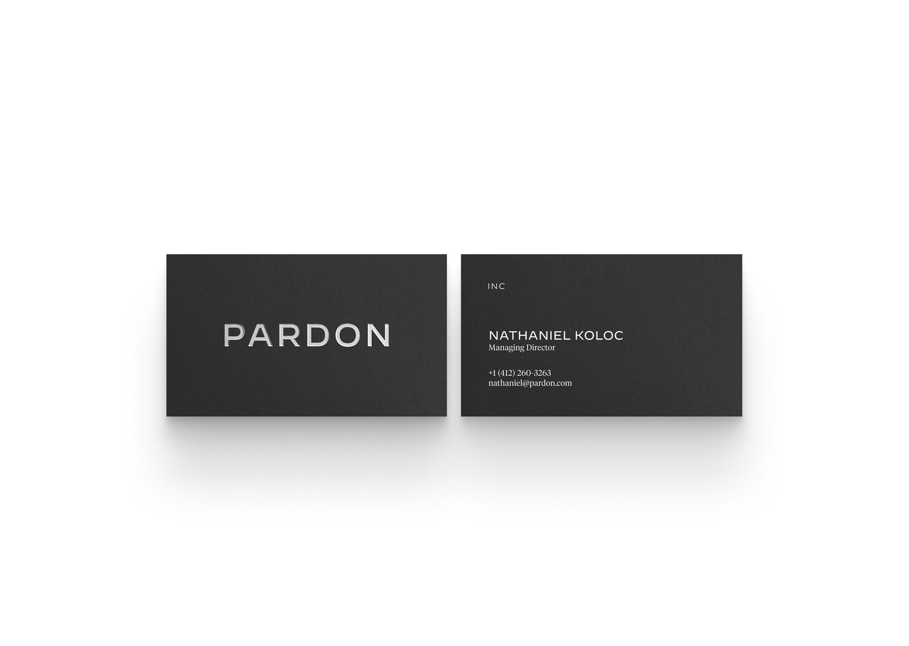
PARDON is a modern family office with a portfolio of ventures, spaces, and cultural projects. As Head of Design, I helped shape how the parent brand showed up across that portfolio.
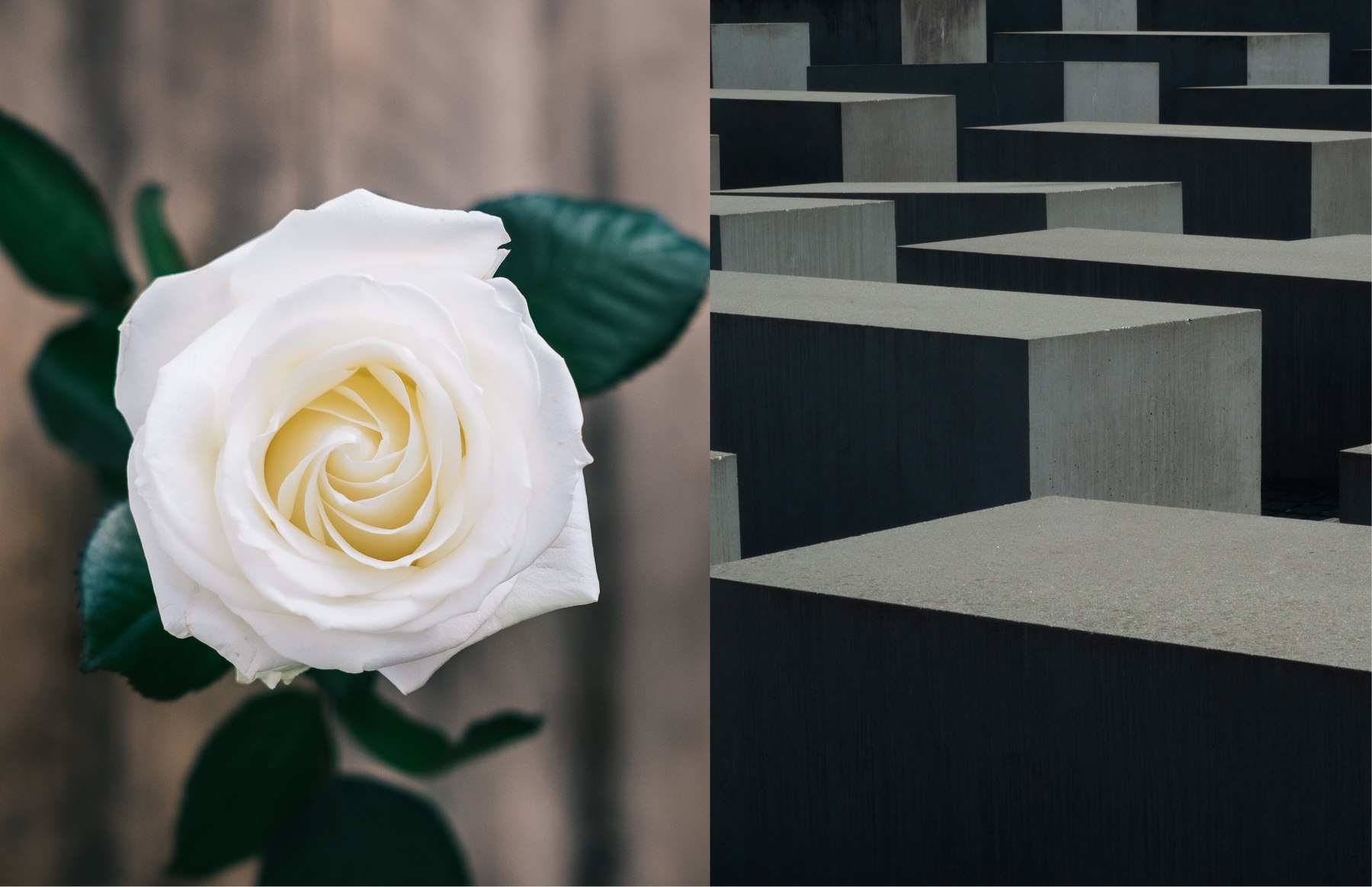
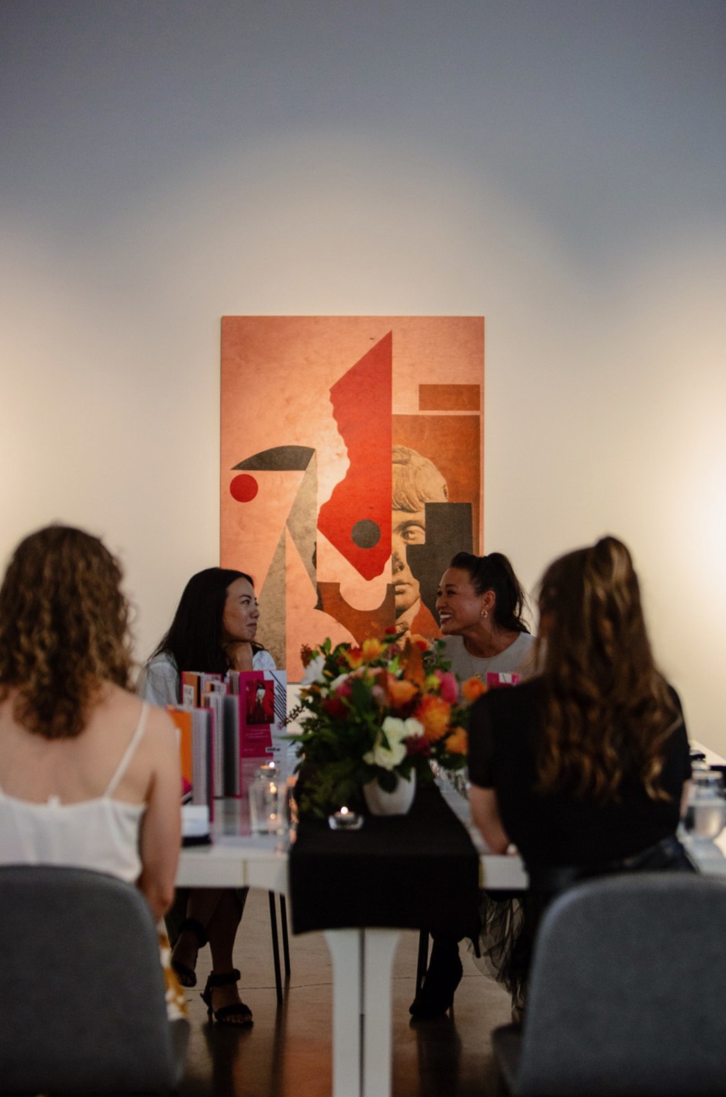
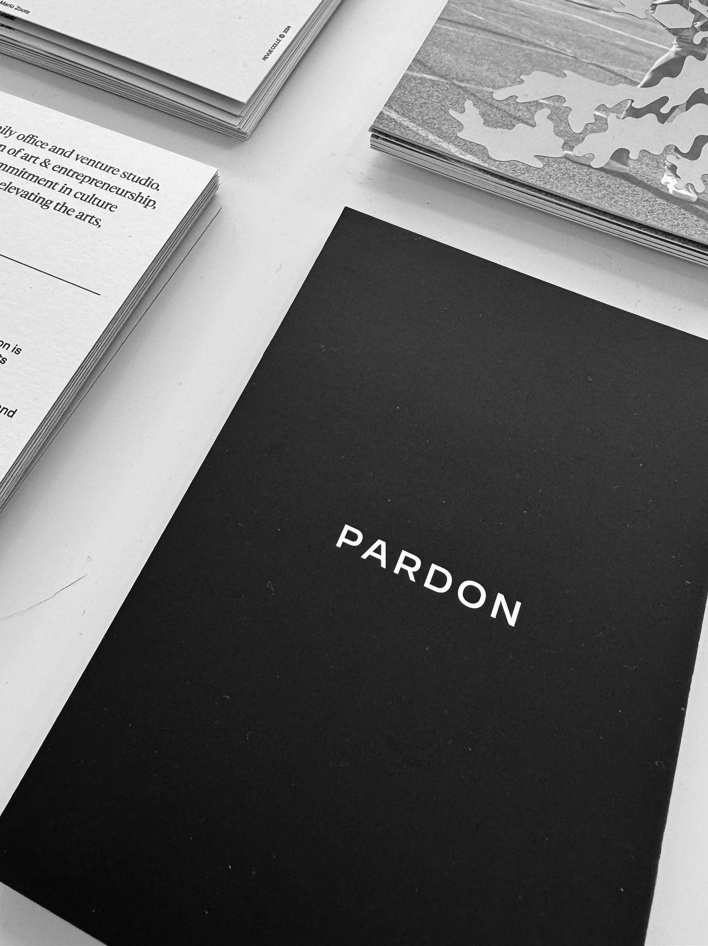
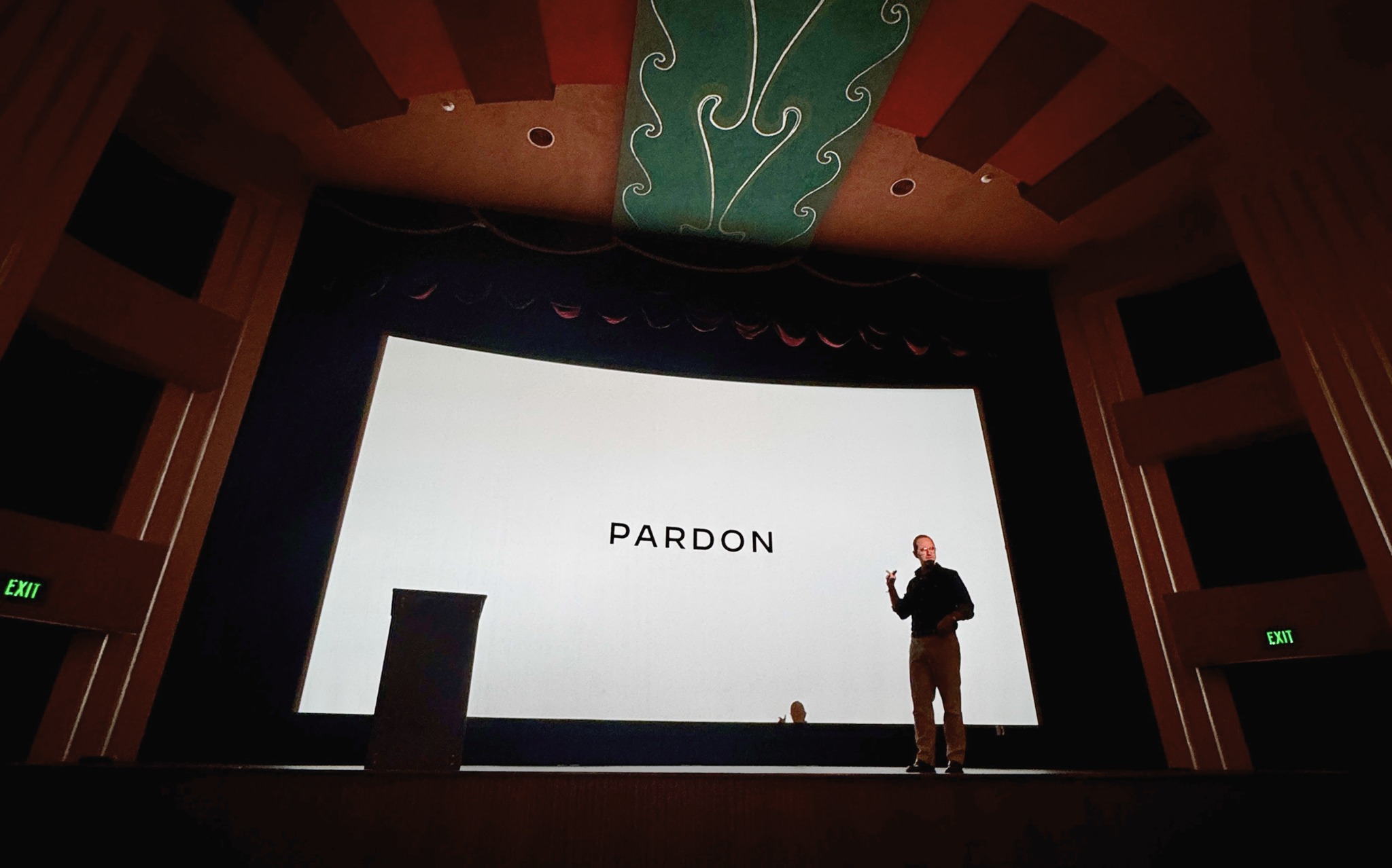
The wordmark could take center stage, as it did on the website. In galleries and gatherings, art, imagery, and the setting often carried the brand.

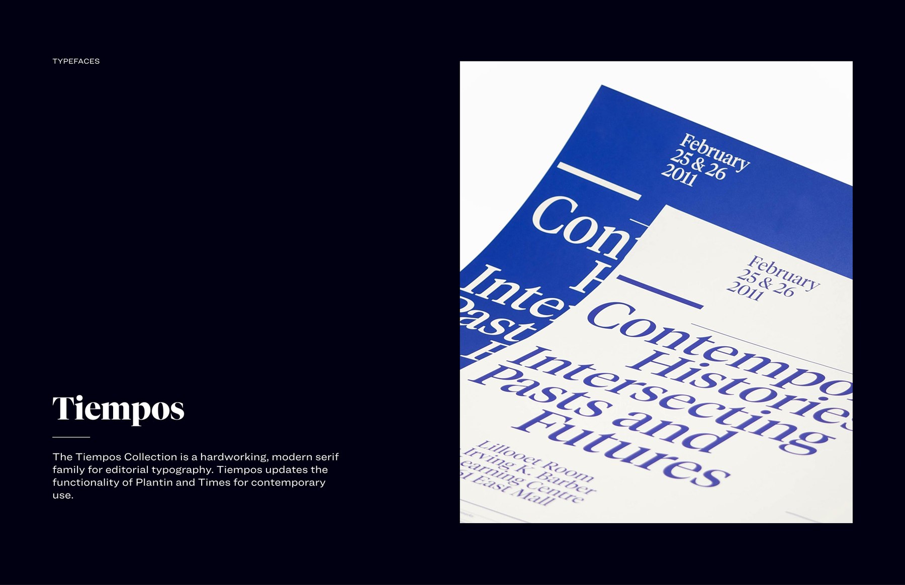
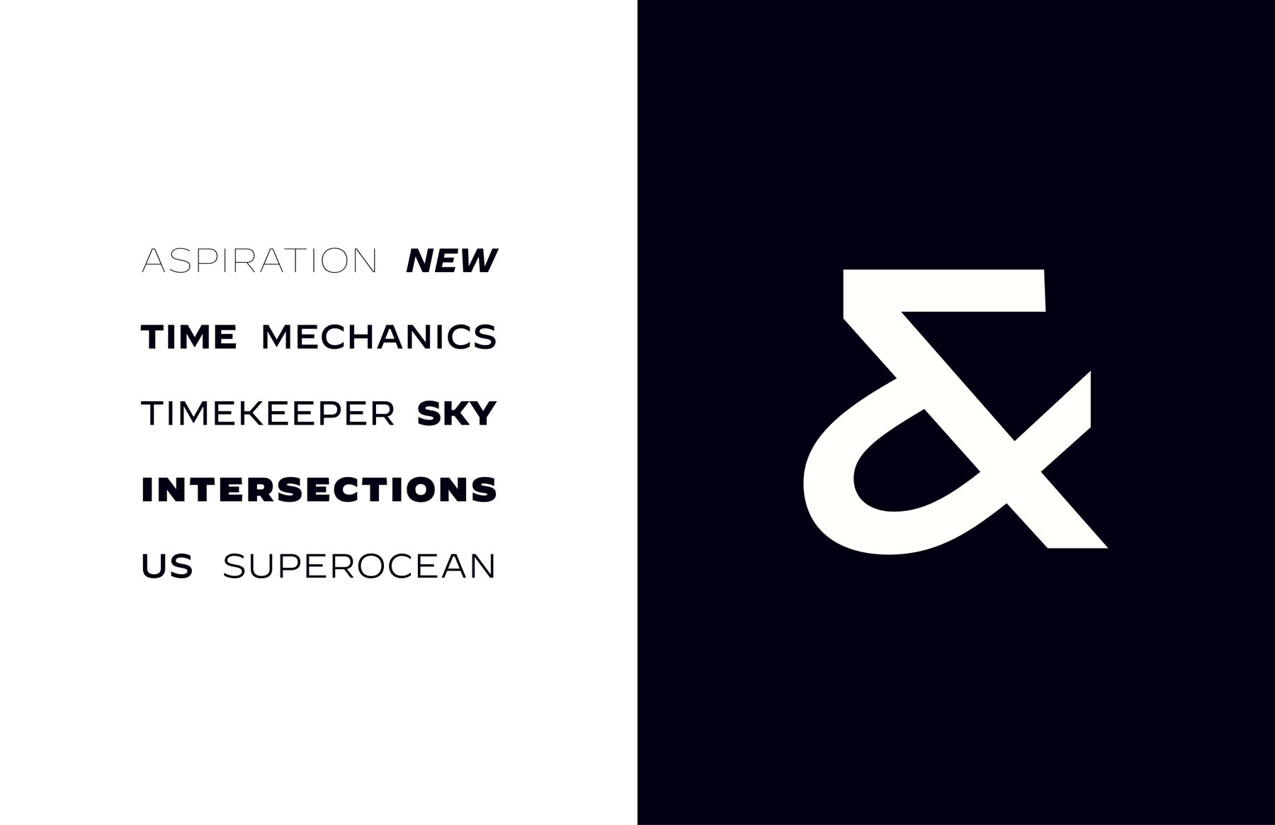



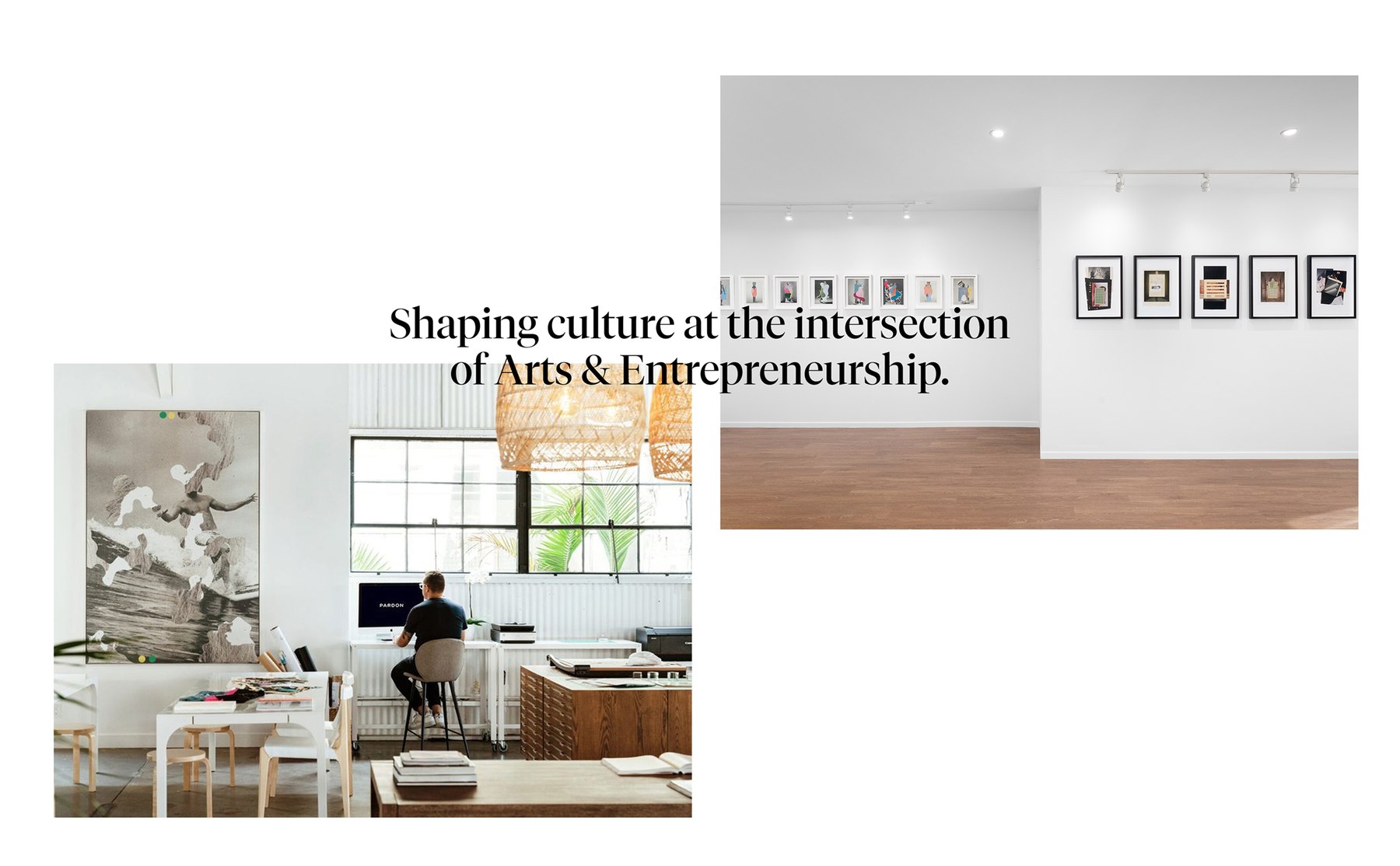
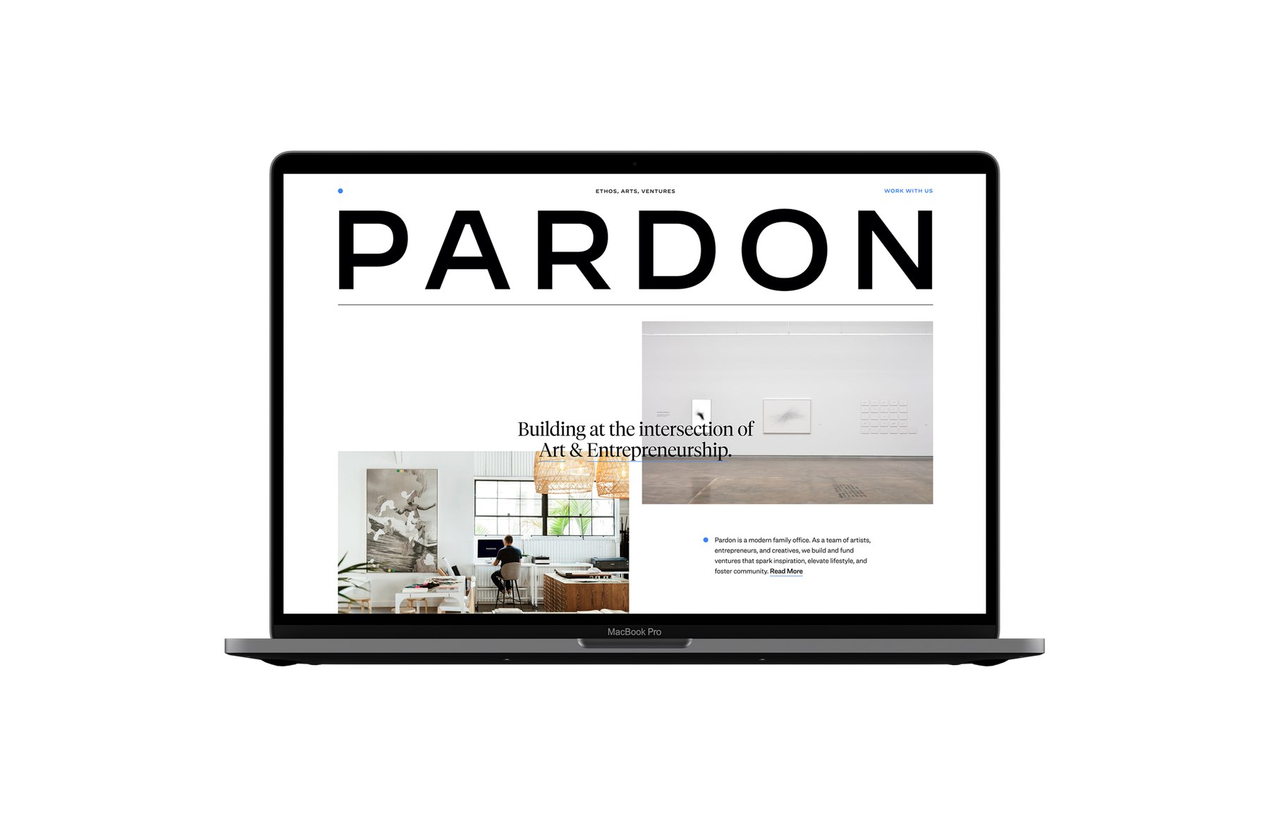
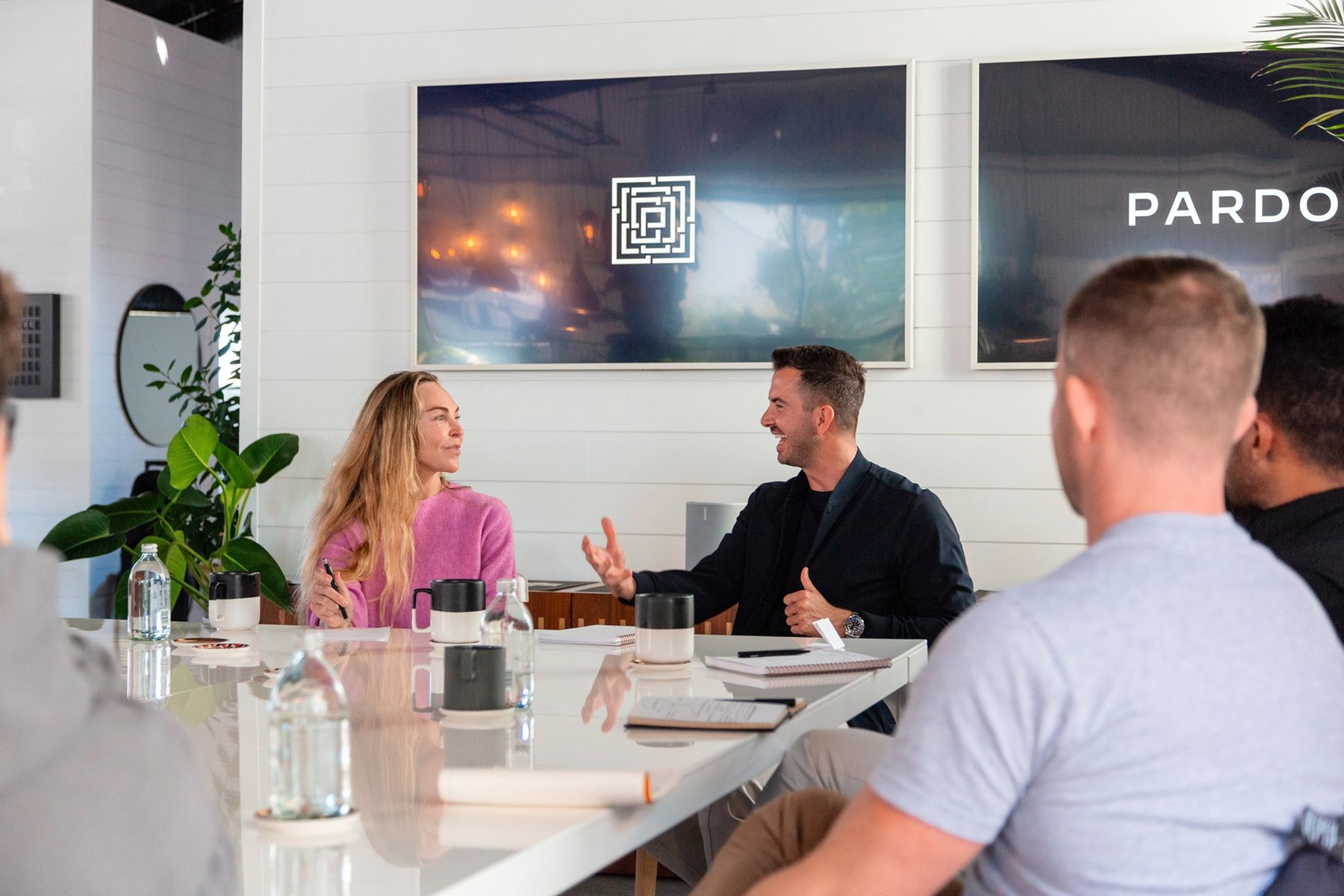
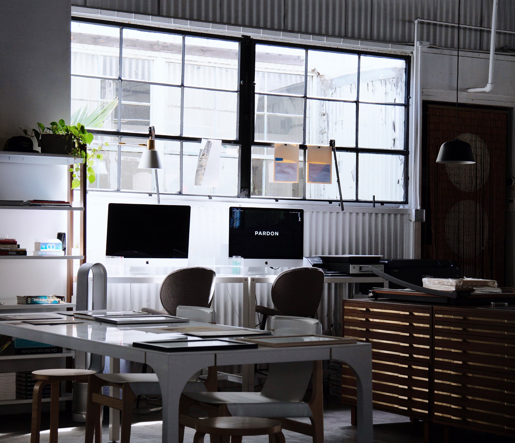
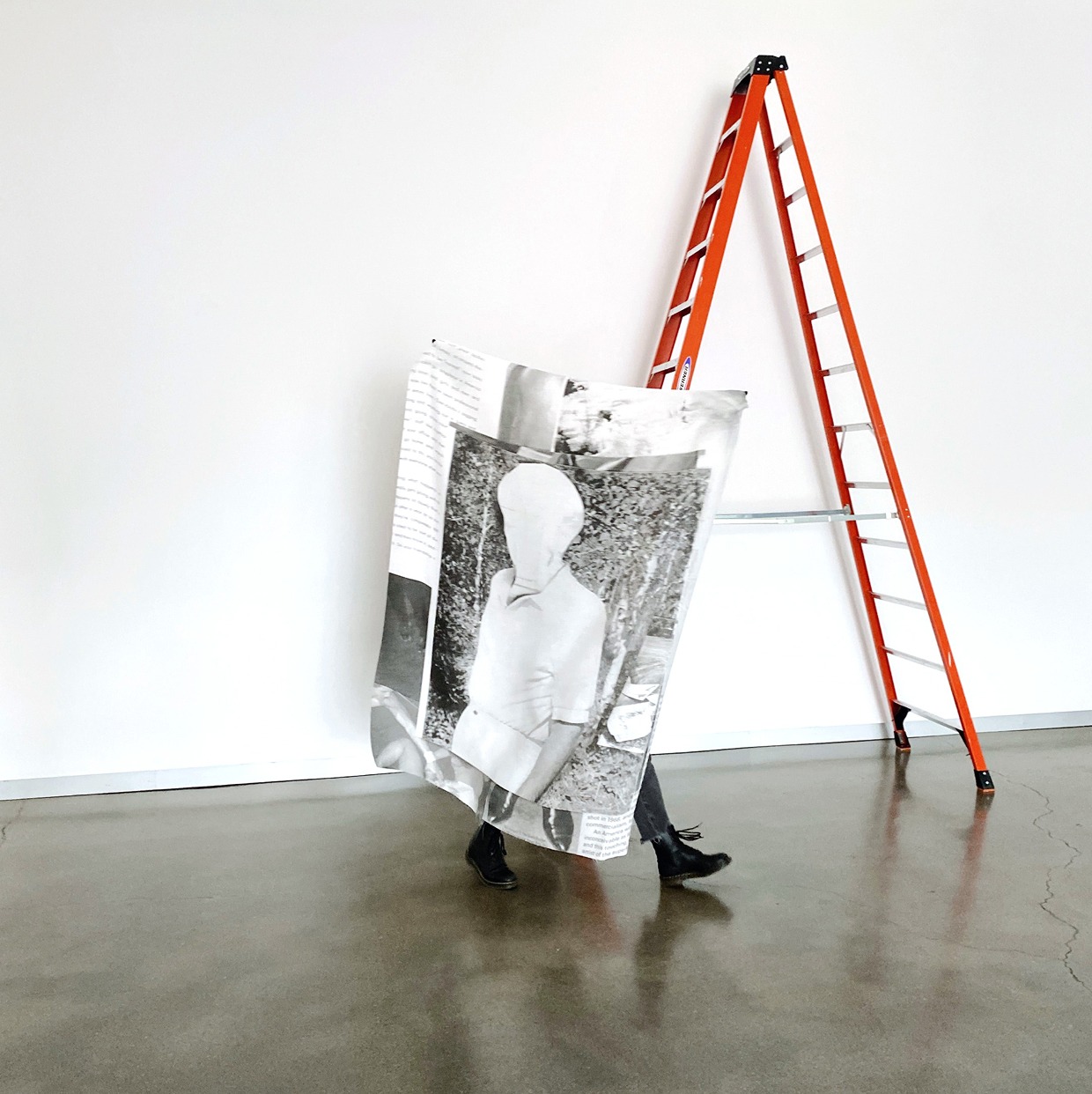
PARDON in real life
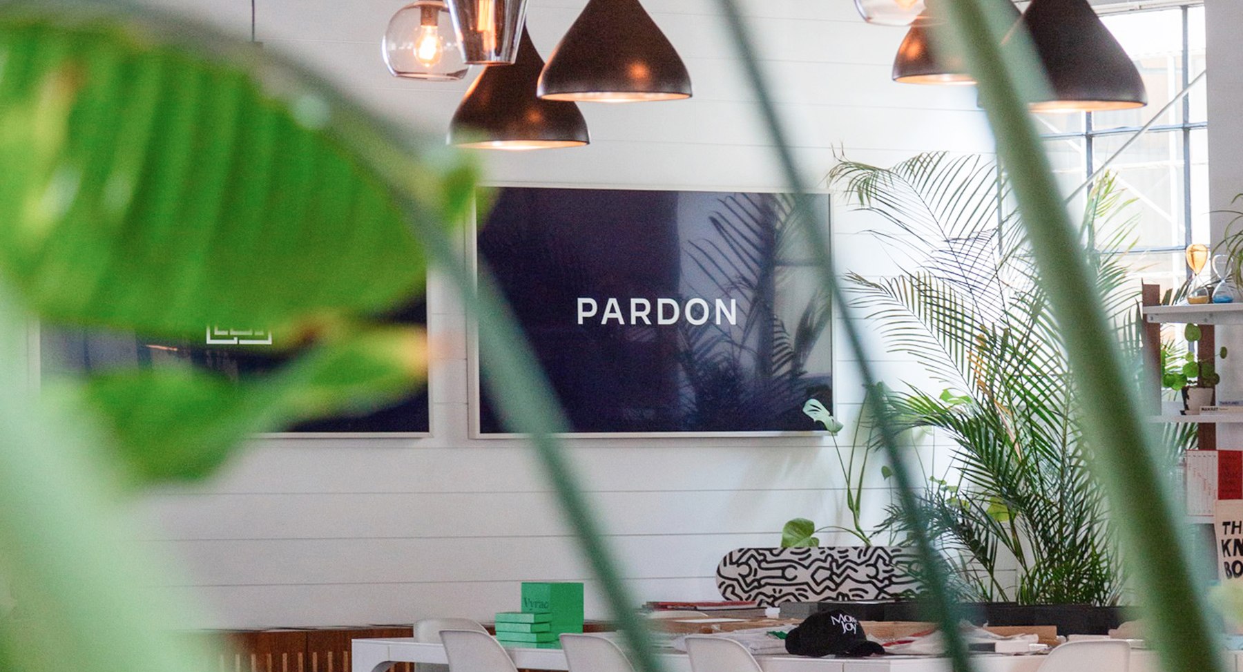
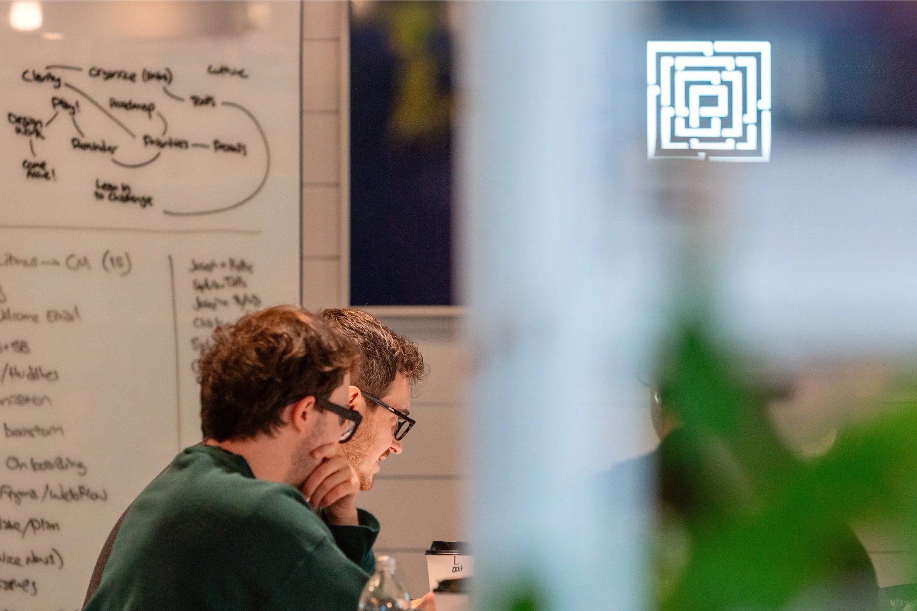
Ventures
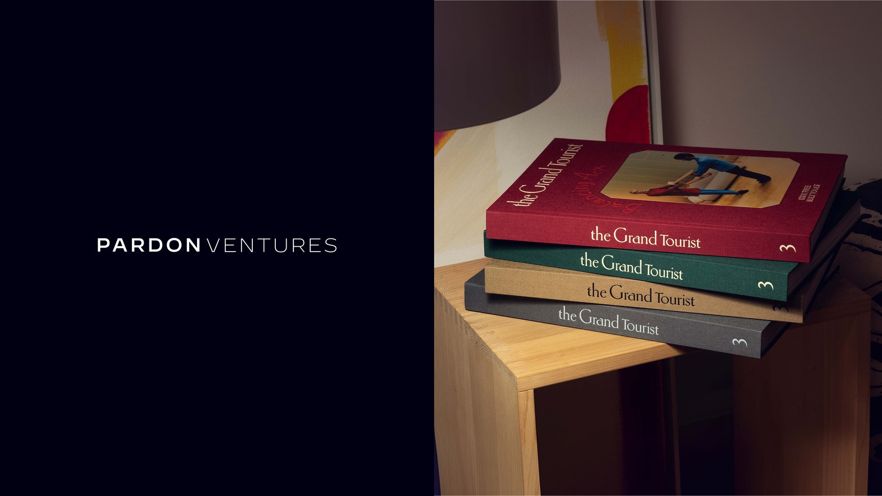
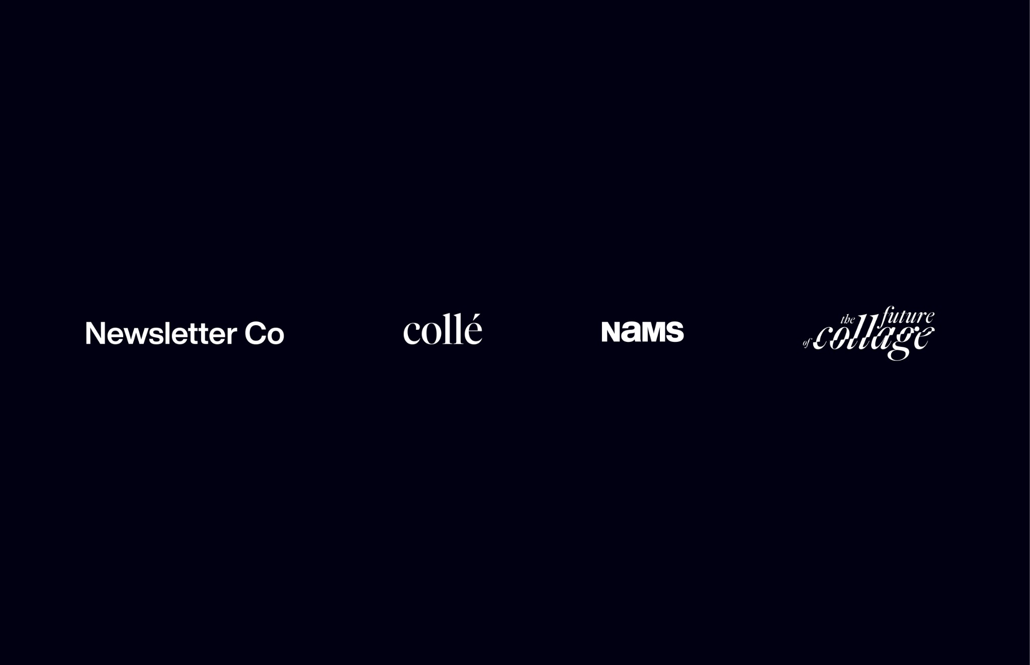
Ventures developed within PARDON had room to establish their own public identities.
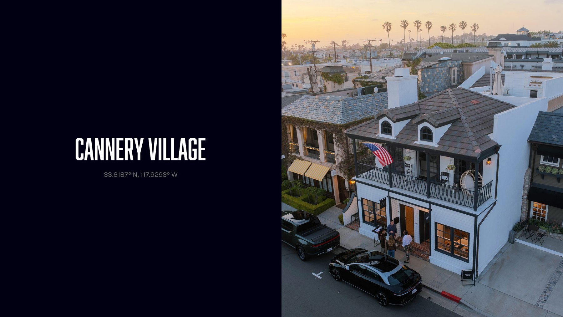
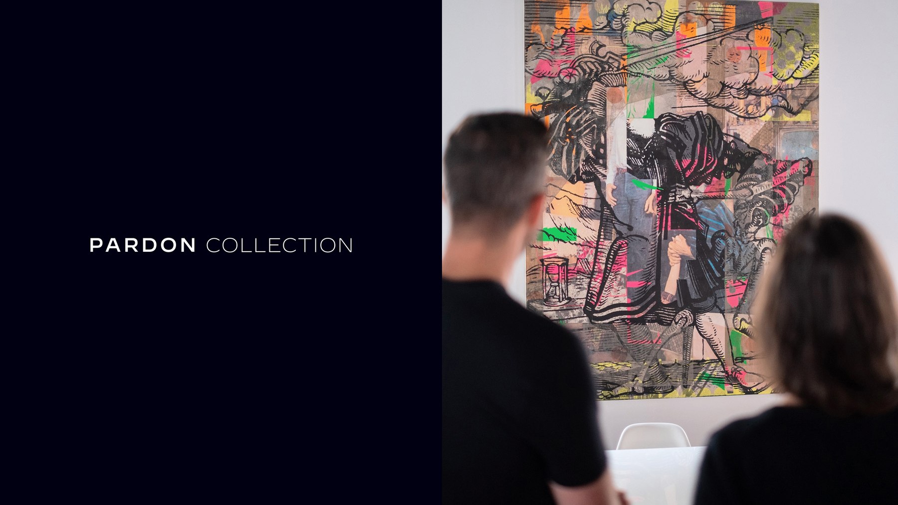
Spaces
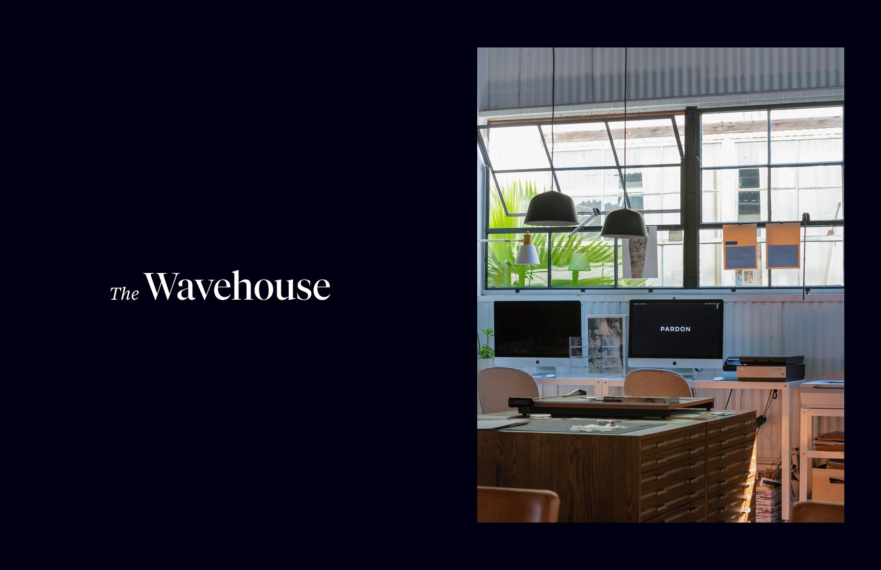
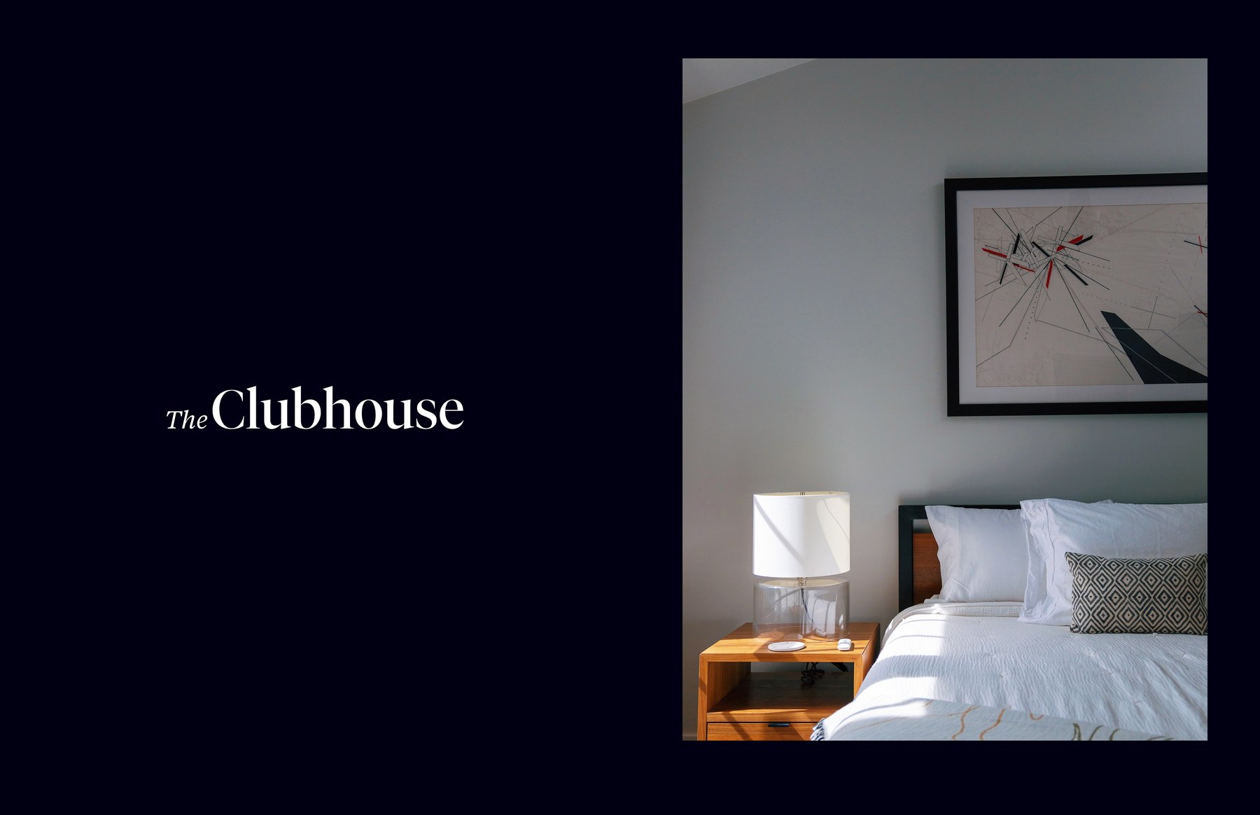
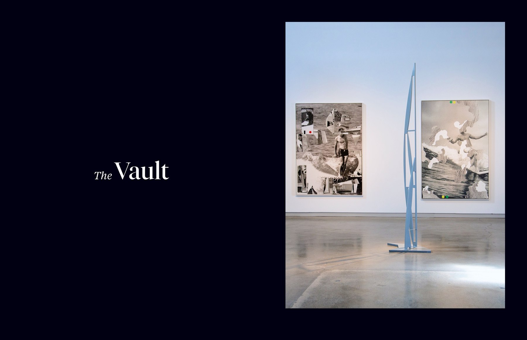
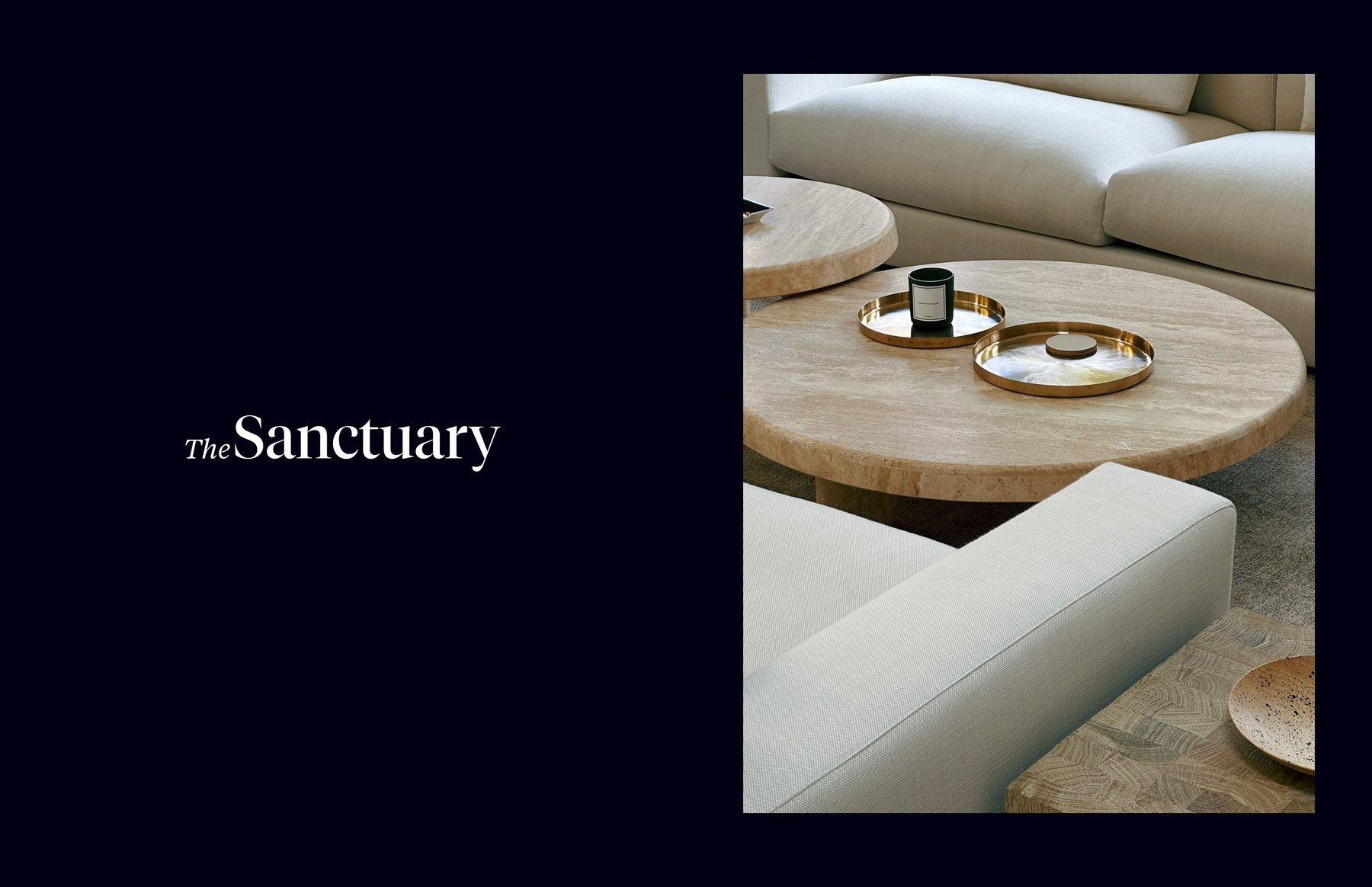
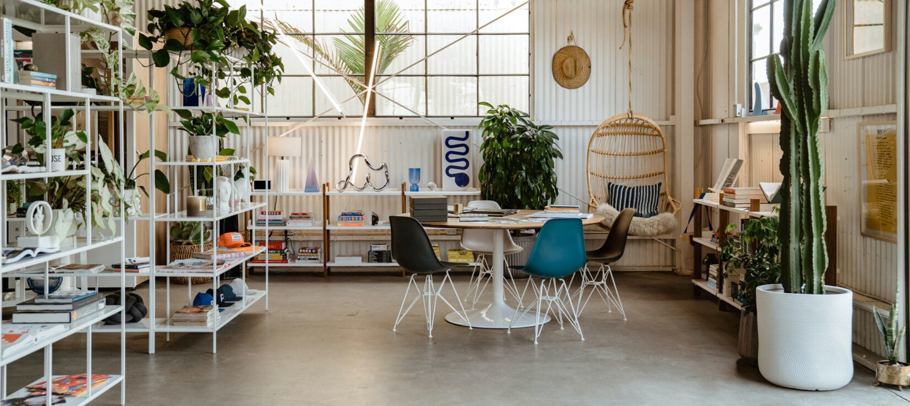
I directed the graphics and visual communications for PARDON’s spaces in dialogue with the interiors and the art on view.